Theatrical Romantic Hair & Color Guide
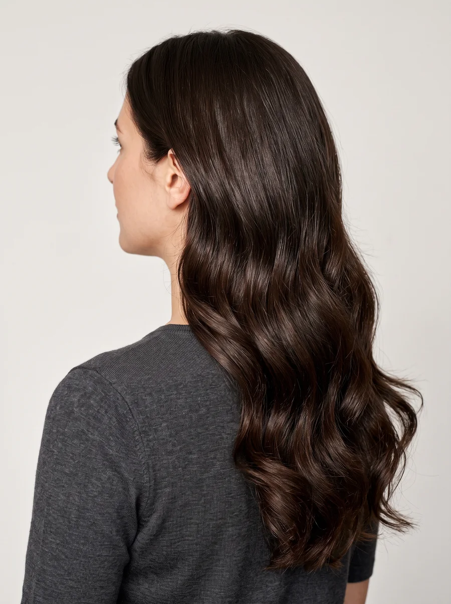
Theatrical Romantic family · Hair & Color
Your cut
Lavish and ornate is the concept — hair that adds a genuinely stylized extra touch to the whole look, rounded and soft in shape, and as full as you can reasonably carry it. Waves, perms, sets, and a bit of teasing are all fair game, as long as the finished effect stays soft rather than stiff. Long hair should look elaborate, voluminous, and clearly well cared for; short hair should look superstylized and coiffed rather than simply cropped. Either way, the cut itself needs a bit of layering to give the shape some curve to work with.
Think of your hair as carrying the same theatrical polish that shows up in your clothes and makeup — soft and rounded at heart, but with a bit more intentional styling than a purely soft Romantic look would need. The goal is hair that looks designed for the moment, not left to its own devices.
Whether your natural texture leans silky and wispy or thick with wave and curl, treat it as the raw material for that stylized shape rather than something to fight. Both textures are workable — the through-line is the layering, since that’s what lets either one hold a set and build into the rounded, full silhouette the concept calls for.
- Severe styles and geometric or blunt-edged cuts.
- Overly layered hair and wash ‘n wear styles.
Your haircolor
Rich and vibrant is the concept — a genuinely glamorous haircolor, whatever the base: browns should run rich and intense, reds fiery, blonds bright, and black true jet black. If gray starts coming in, covering it is usually the safer call, though dramatic silver streaks can look wonderfully theatrical on the rare few who inherit them naturally, especially against a very dark base. Use your skin’s undertone and natural contrast level to find your lane in the chart below — contrast here means how far your natural hair color sits from your skin tone, with a wide gap reading high-contrast and a close gap reading low-contrast.
| Warm skin (golden) | Cool skin (blue) | |
|---|---|---|
| High-Contrast | Deep to Rich Chestnut Brown with a Red cast; Fiery Auburn/Mahogany with rich coppery lights; Rich Copper with subtle golden lights; Warm White; cover gray completely | Black (no highlights); Dark Ash Brown (no highlights); Silver/White; Silver sprays around the face; cover gray unless sprayed around the face |
| Low-Contrast | Light Golden Brown with rich lights; Rich Honey Blond with a Red cast; Bright Strawberry; Light/Bright Auburn or Red; cover gray completely | Medium to Soft Ash Brown with subtle Ash lights; Medium to Pale Ash Blond with subtle Ash lights; Platinum; Silver/White; cover gray unless frosty-looking |
The base needs to carry real richness — an overall color process rather than scattered lightening — with highlights added only to build shimmer on top of that already-rich foundation. Because your coloring can run genuinely vivid across the whole warm-cool, high-low contrast range, it’s worth confirming both your undertone and your natural contrast level before picking a lane in the chart, rather than assuming from your skin tone alone. A high-contrast reading calls for real depth or real brightness — chestnut, mahogany, black, silver-white — while a low-contrast reading softens that same intensity without losing the richness underneath it. Either way, the finished color should look deliberate and glamorous rather than accidental, the same standard the rest of your look is held to.
- Overly pale colors, except platinum.
- Highlights meant to “soften” the look — soft reads as tired here, not gentle.
- Salt-and-pepper gray, unless the base is very dark with silvery-white streaks.
Your palette
Think of your color story as intentionally over-the-top rather than balanced — every outfit needs one note that reads as unmistakably vivid, even when everything around it stays soft. Pastel and saturated color can sit side by side without clashing, since the whole point is a hint of drama layered onto something inherently pretty. Pale shades stay light-handed when paired with equally light accessories; darker shades need either a bright accent to lift them or an evening fabric — charmeuse, satin, lace, velvet — with enough sheen to keep the darkness glamorous instead of flat. Prints follow the same one-loud-element rule: reach for something large-scaled and fluid, a floral rendered in soft blooming color or an abstract wash that feels hand-painted rather than printed, with curves and blur standing in for anything hard-edged.
- One unmistakably vivid note in every outfit, even against a soft backdrop.
- Pale shades with light accessories; darker shades lifted by a bright accent or a sheeny evening fabric.
- Large, fluid prints — blooming florals or hand-painted abstract washes.
- Head-to-toe darks or head-to-toe neutrals.
- Monochromatic color schemes.
Want the full picture? Take the quiz to confirm your type, or head back to the Theatrical Romantic hub.
Unofficial guide inspired by the Image Identity system in David Kibbe’s Metamorphosis (1987). Body types describe line, not worth — every type is the goal, not a consolation prize.