Romantic Hair & Color Guide
Romantic family · Hair & Color
Your cut
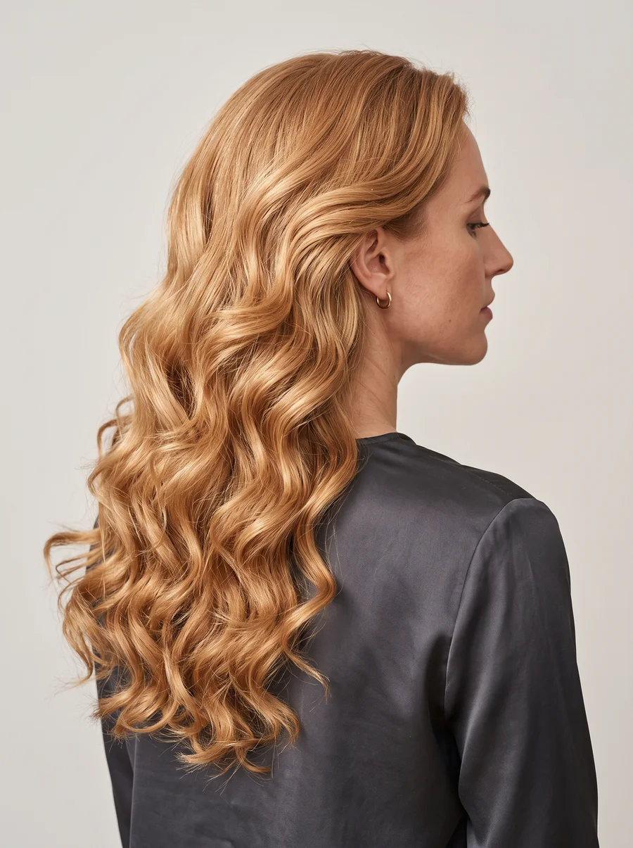
Soft and stylized is the whole assignment, with a wispy silhouette that frames the face rather than pulling away from it. Whatever your natural texture — silky and fine, or thick with wave and curl — the cut needs enough layering to work with that texture and hold a set, since the finished look should carry an ornate, styled quality rather than looking undone. A perm is fine if you want more curl to work with, but the hair still needs to be set into shape afterward rather than left to dry on its own.
The point of all that setting and layering is to keep the hair looking soft and finished, never stiff or over-structured. Think of your hair as another surface for the same rounded softness that runs through your clothes and your makeup — wisps framing the face, movement in the shape, nothing blunt or severe interrupting the line.
Texture is actually an advantage here rather than something to fight into submission. Natural wave or curl gives the cut something to hold onto, so a set lasts longer and looks less like effort. Silky, wispy hair can be coaxed into the same soft framing with a lighter touch — a curling iron or rollers rather than a perm — but either texture needs that layering underneath to keep the whole shape from going flat or heavy.
- Geometric shapes with angular edges, or sleek, smooth styles.
- Blunt-edged or wash ‘n wear, blow-dry styles.
- Overly layered, messy hair, or stiff bouffant shapes.
Your haircolor
Rich and luxurious is the concept, whatever hue you land on. Highlights work well, especially placed around the face, unless you’re a deep brunette — lightening a very dark brunette base tends to age the look rather than freshen it. Soft sprays of color framing the face read as lovely in medium-to-light shades. Extreme colors — platinum blond, blue-black, fiery red — need caution unless one of them was your natural starting point; if it was, resist the urge to lighten it, since that shift alone can add a decade to how the look reads. Use your skin’s undertone and your natural contrast level to find your lane in the chart below — contrast here means how much your natural hair color differs from your skin tone, a wide gap reading high-contrast and a close gap reading low-contrast.
| Warm skin (golden) | Cool skin (blue) | |
|---|---|---|
| High-Contrast | Medium to Soft Chestnut Brown with Red lights; Rich Auburn/Copper with golden lights; Warm White; cover gray completely | Dark Ash Brown (no highlights); Medium Ash Brown (no highlights); Silver/White; Silver sprays around the face; cover gray unless sprayed around the face |
| Low-Contrast | Rich Honey Blond with subtle Red lights; Rich Golden Blond with subtle Yellow lights; Bright Strawberry/Light Auburn; Bright Yellow Blond; Warm White; cover gray completely | Medium to Soft Ash Brown with subtle Ash lights; Medium to Light Ash Blond with Ash lights; soft frosting around the face; cover gray unless a very soft Silver |
Whatever shade you land on, the overall haircolor should carry the richness — a full process rather than scattered lightening — with subtle highlights added only for shimmer, not for a whole new tone. The chart is really just a way of finding the richest, most flattering version of your own natural coloring, not a push toward anything more extreme.
Because your coloring can genuinely fall anywhere on the warm-cool and high-low contrast spectrum, the chart is worth checking twice — once for your undertone, and once for how much your natural hair and skin actually differ. A woman who reads as low-contrast might be tempted toward a high-contrast shade for drama, but the richness principle holds regardless of where you land: depth and warmth of tone matter more than how far the shade sits from your skin.
Your palette
Build your everyday palette around a blended watercolor effect — soft pastel and saturated brights sitting together rather than staying in separate lanes. Melon, salmon, rose, grape, and raspberry all sit at the heart of this palette on equal footing — pick by mood, not by occasion. Treat pale neutrals — dove gray, taupe, white, bone — as connective tissue, the shade that lets the fruitier colors stand out rather than a look in their own right. Prints follow the same softness: abstract swirls of blended color, or generously scaled florals with loose, painterly edges.
- Core shades: melon, salmon, rose, grape, and raspberry — all equally yours.
- Blend them watercolor-soft rather than color-blocking.
- Neutrals — dove gray, taupe, white, bone — as connective color, not the main event.
- Dark or neutral monochromatic color schemes.
- Sharp color contrast.
- Geometric, small, symmetrical, or animated prints, plus stripes and plaids.
Want the full picture? Take the quiz to confirm your type, or head back to the Romantic hub.
Unofficial guide inspired by the Image Identity system in David Kibbe’s Metamorphosis (1987). Body types describe line, not worth — every type is the goal, not a consolation prize.