Dramatic Makeup Guide
Dramatic family · Makeup
The Chiseled Face
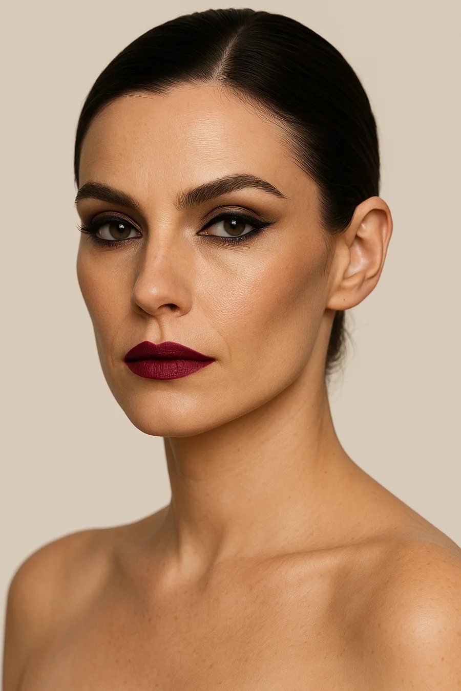
Your makeup concept is sculpture, not softness. The idea is a sharply defined face — angular contour, smoky eyes, deep blush placed with precision, and a lip color strong enough to hold its own against everything else. High contrast is the throughline: dark against light, matte against sheen, never a face that blurs at the edges.
This is the same geometric logic that runs through your hair and your clothes. Kibbe describes the Dramatic physicality as something closer to architecture than softness — sleek, urbane, built on clean edges — and your makeup is where that architecture gets applied straight to the face. The chisel is the whole point: every element should look built with intention, not blended away.
How to apply the idea
Start with the eyes. Your narrow, almond or sloe shape wants a strongly defined outline and smoky color built up in distinct layers, finished with a dark, precise liner — the goal is definition, not a wash of color. Resist the instinct to soften the shape with a hazy, all-over blend; distinct bands of color read as deliberate on you, where a haze just reads as smudged. On the cheek, place blush along the cheekbone in a sharp, sleek shape rather than a soft round blend — you’re drawing a line, not building a glow, and a rounded blush all but disappears against bone structure this defined. Lips take a straight, narrow line with a deep or vivid color and a crisp outer edge — matte is the base, with a touch of gloss layered on top rather than an all-over shine. Keep the outline exact rather than overdrawn; the color itself is doing the work, not the shape.
Your colors
Kibbe splits palettes into four color groups by undertone and contrast. Find the group closest to your natural coloring — Group I and II run cool, Group III and IV run warm — and use the eyeshadow trio (outer lid, orbital bone, highlighter) with the matching blush and lip numbers below. Whichever group is yours, the structure stays identical across all four: a dark, defined lid color, a slightly lighter orbital-bone shade to carve the crease, and a highlighter to stop the whole eye from reading flat. Only the hues change from group to group — the architecture doesn’t.
| Group I — Contrast / Winter | |||
|---|---|---|---|
| Eyeshadow (lid / orbital / highlighter) | Blush | Lips | |
| 1 | Black / Royal Blue / Iced Lavender | Burgundy | Deep Cranberry |
| 2 | Navy / Bright Purple / Medium Pink | Deep Scarlet | Scarlet |
| 3 | Royal Purple / Violet / Iced Pink | Fuchsia | Fuchsia |
| Group II — Dusty / Summer | |||
|---|---|---|---|
| Eyeshadow (lid / orbital / highlighter) | Blush | Lips | |
| 1 | Dusty Navy / Periwinkle / Pale Pink | Dark Rose | Deep Rose to Raspberry |
| 2 | Smoky Purple / Soft Fuchsia / Medium Pink | Deep Rosy Red | Rosy Blue-Red |
| 3 | Charcoal / Mauve / Lavender | Soft Fuchsia | Fuchsia / Deep Orchid |
| Group III — Rich / Autumn | |||
|---|---|---|---|
| Eyeshadow (lid / orbital / highlighter) | Blush | Lips | |
| 1 | Sable / Copper / Gold | Chestnut | Mahogany to Deep Copper |
| 2 | Forest / Olive / Apricot | Orange Red | Dark Brick Red |
| 3 | Deep Teal / Turquoise / Yellow | Terra Cotta | Terra Cotta |
| Group IV — Vibrant / Spring | |||
|---|---|---|---|
| Eyeshadow (lid / orbital / highlighter) | Blush | Lips | |
| 1 | Soft Olive / Jade / Pale Yellow | Deep Peach | Peach |
| 2 | Teal / Turquoise / Pale Peach | Orange Red | Orange Red |
| 3 | Soft Chestnut / Copper / Pale Gold | Salmon Pink | Salmon Pink |
Line eyes in the same color family as your lid shade, several shades darker, keeping the finish matte and smoky rather than shimmery. Lip color should stay matte at its base, with just a touch of gloss added on top — not an all-over frost. Treat that gloss as a finishing touch rather than the main event; the color underneath is what carries the look.
Avoid
Both failure modes point the same direction: anything that blurs the line between features works against a face built to read as sculpture. A heavily blended, watercolor face erases the definition you’re aiming for, and a face piled high with sparkle or scattered color pulls attention away from the bone structure that’s actually your strongest asset. When in doubt, ask whether a choice adds definition or dissolves it — that single question covers nearly every decision on this page.
- A soft, watercolor-blended face where nothing is clearly defined.
- An overly colorful or heavily sparkly face that competes with your bone structure instead of framing it.
Want the full picture? Take the quiz to confirm your type, or head back to the Dramatic hub.
Unofficial guide inspired by the Image Identity system in David Kibbe’s Metamorphosis (1987). Body types describe line, not worth — every type is the goal, not a consolation prize.