Soft Natural Hair & Color Guide
Natural family · Hair & Color
Your cut
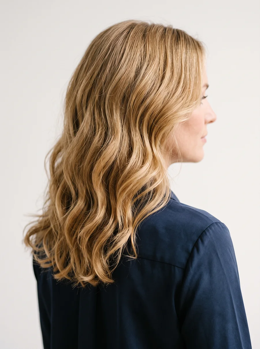
Your cut wants to feel soft and unstructured — a loosely layered shape that lands somewhere between tousled and sensual rather than precisely finished. Length works best moderate to long, and there’s nothing wrong with reaching for a perm or other processing if it adds body or a gentle curl; the goal is texture, not rigid control. Whatever your natural texture happens to be — a wispy fineness when it’s straight, a silkier hand than a coarse one when it bends or coils — the cut should show that softness off rather than fight it.
That softness is doing the same job as everything else in your styling: an easy, open base with a small, considered flourish layered on top. A cut that looks completely undone loses the polish; a cut that looks elaborately set loses the ease. What you’re after sits between the two — closer to bedhead with intention than to a stiff blowout.
- Severely geometric or blunt, symmetrical cuts.
- Overly ornate or stylized hair (a genuinely original, flowing evening style is the one exception).
- Boyishly short, cropped styles.
Each of those avoids trades away the same thing — real texture and shape — for either a stripped-down cut with nothing behind it or a stiffly built one with too much in front of it.
Your haircolor
Haircolor should look rich and completely natural — never like it came from a bottle. If you do color it, keep the change subtle: soft lowlights woven through the base, a cellophane gloss for shine without changing the shade much, or henna for warmth all work in your favor without announcing themselves. The test is simple — a stranger should assume this color grew in, not that it was applied.
To find your family in the chart below, start with your undertone — warm and golden, or cool and blue — then place yourself on the contrast scale: how much your natural hair depth differs from your skin. High-contrast means the two sit far apart; low-contrast means they sit close. Undertone picks the column, contrast picks the row, and where they cross is your shade family.
| Warm skin (golden) | Cool skin (blue) | |
|---|---|---|
| High-Contrast | Rich Chestnut Brown w/ subtle Red light; Deep Auburn/Mahogany; Medium Golden Brown w/ subtle golden light; Warm White; cover gray completely | Dark Ash Brown (no highlights); Medium Ash Brown (no highlights); Silver/White; soft Silver sprays around face; leave gray or cover by re-creating original color |
| Low-Contrast | Light Golden Brown w/ warm lights; Rich Honey Blond w/ warm lights; Light Auburn/Copper w/ golden lights; Rich Golden Blond w/ Yellow lights; Warm White; cover gray completely | Medium to Soft Ash Brown w/ subtle Ash lights; Deep to Medium Ash Blond w/ subtle Ash lights; Pale Ash Blond; soft White/Silver Gray; leave gray or cover by re-creating original color |
Whatever shade you land on, start from a full, rich overall color process as your base — this type depends on depth, and a single all-over application builds that depth more reliably than piecemeal touch-ups. If you’re low-contrast, a faint highlight worked in on top can add a bit of shimmer and lift the color without disturbing that natural look.
- Boldly theatrical shades — blue-black, platinum, straw-yellow blond, fiery red.
- Hair lightened well past its natural depth.
Both extremes pull the same trick: they turn hair into a statement piece, when the whole point of your color is to look like it was never a decision at all.
Your palette
How you combine color matters more here than which shade you start with. Pairing is the real lever: soft set against bright, or bright set against dark, reads far more flattering on you than a stark light-against-dark combination, and a bold bright-on-bright clash is a fair option for off-duty days rather than a mistake. Prints follow suit: reach for organic, soft-edged shapes with an abstract feel, sized from mid-range up toward fairly large, in colors that either wash together like watercolor or turn up to full vivid strength — just keep the outline a touch irregular rather than crisply cut. The one true misstep is a flat, single-tone outfit; break it up with a second shade, or skip it.
- When you’re combining around your coloring, let a soft tone anchor a bright one, or set bright against dark — either reads better on you than a flat light-versus-dark match-up.
- A bold bright-on-bright mix, saved for casual days.
- Organic, abstract shapes in a mid-to-larger scale — soft watercolor blending or full, saturated color — with an outline that stays a little irregular rather than crisp.
- Dark shades folded in as an accent or combination piece, never worn solo head to toe.
- A flat, single-tone outfit with nothing to break it up.
- Tiny, evenly matched, or rigidly geometric prints, plus anything that tips into overly precious or twee pattern territory.
Want the full picture? Take the quiz to confirm your type, or head back to the Soft Natural hub.
Unofficial guide inspired by the Image Identity system in David Kibbe’s Metamorphosis (1987). Body types describe line, not worth — every type is the goal, not a consolation prize.